
AI-powered workflow
How to visualize raw data without cleaning it manually
3 min read
Your data isn't a clean CSV. It's a Slack message, a lab notebook, a table someone copy-pasted without headers, or rows with units glued to the numbers. You shouldn't have to reformat it by hand just to see what's going on.
DataToChart's AI normalization takes your messy input and structures it automatically, so you can go from raw notes to a chart without touching a formula.
Why raw data is a charting dead-end
Spreadsheets and most charting tools only accept clean, structured input. Anything that doesn't fit the mold gets rejected, or worse, silently misread.
- Mixed date formats: "Mon 12/05", "12-May-25" and "2025/05/12" sitting in the same column.
- Units glued to numbers: "1.45m", "2,3 kg" or "45%" get treated as text, so they never plot.
- Inconsistent row structure: some rows have three values, others four, with no clear header.
- Copy-paste artifacts: stray spaces, dashes, bullet characters and merged cells.
- No column headers at all: just raw values in an order you happen to remember.
What raw data actually looks like
Running session notes pasted straight from a training log. No spreadsheet will chart this as-is.
Mon 12/05 5,2km
Tuesday 13/05  6.1 km
Wed 14/5 - 8km
Thu 15/05: 5.8km (easy)
Fri 16/05 10,5km
Click "Normalize with AI" and let the model do the work
Paste your raw data into DataToChart, then click the "Normalize with AI" button. An AI model reads your input, detects the structure, standardizes units and date formats, and builds a clean table from it.
Anything it wasn't sure about is surfaced as a warning above the chart: conflicting formats, missing headers, values it had to interpret. Nothing is assumed silently, so you stay in control of what the chart actually shows.
datatochart.app
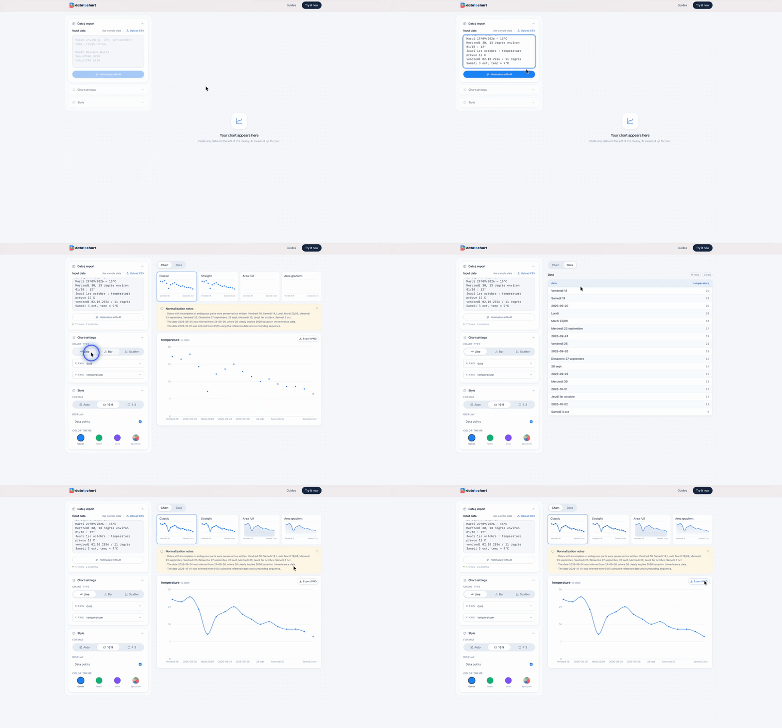
3 steps from raw notes to chart
1.Paste anything
Drop your raw data into the import area, whether that is loose notes, pasted rows or a rough table. No reformatting needed.
2.Click "Normalize with AI"
The AI detects columns, standardizes units and dates, and builds a clean structured table. Warnings flag anything ambiguous.
3.Review warnings, pick your chart, export
Scan the warnings to check the AI read your data the way you meant it, select your chart type, and download a high-resolution PNG.
Before / after example
Raw input
Mon 12/05 5,2km
Tuesday 13/05  6.1 km
Wed 14/5 - 8km
Thu 15/05: 5.8km (easy)
Fri 16/05 10,5km
After normalization
Date,Distance (km)
2025-05-12,5.2
2025-05-13,6.1
2025-05-14,8.0
2025-05-15,5.8
2025-05-16,10.5
Paste your messy data. The AI handles the rest.
No cleaning. No formulas. No sign-up.
Try it now, it's free